Logo
Dancing Fire X Flow of Fragrance
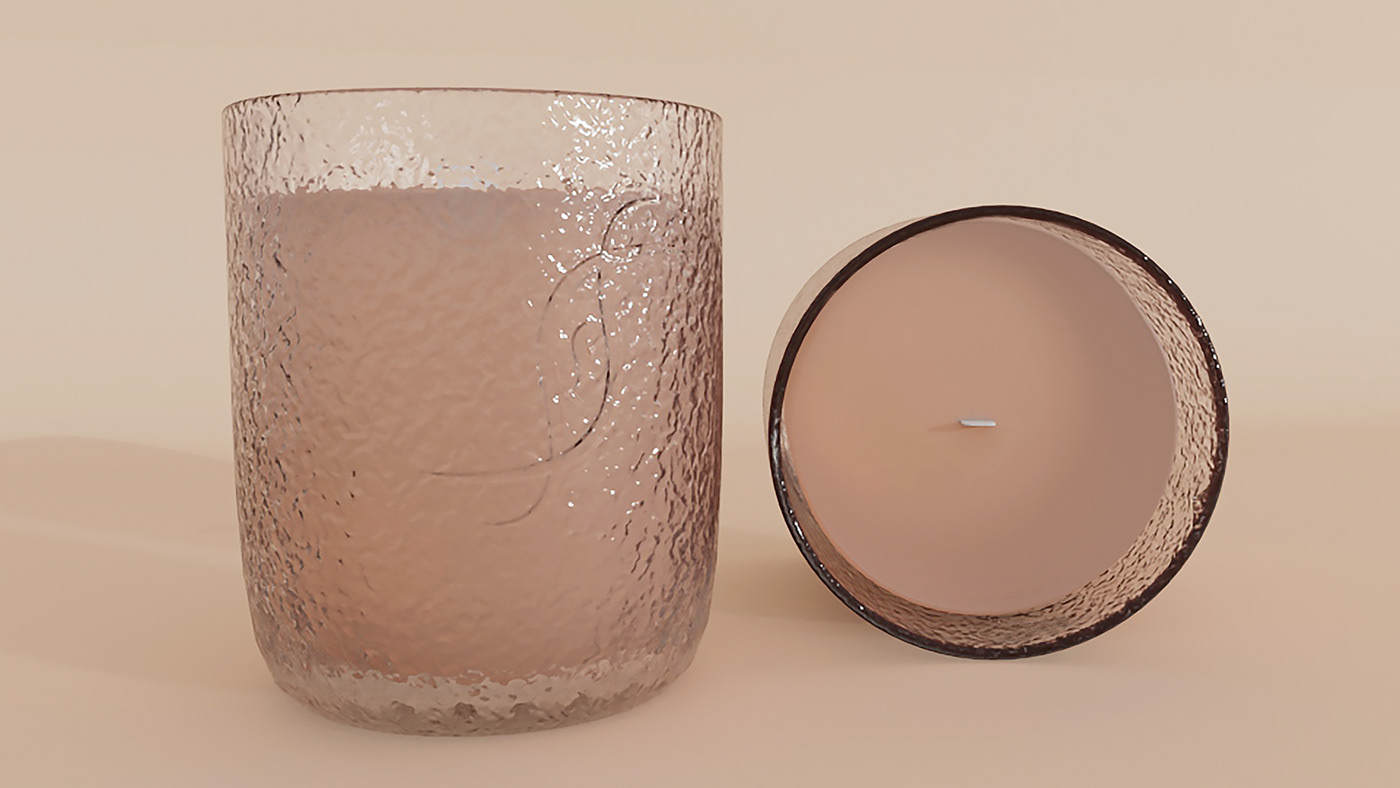
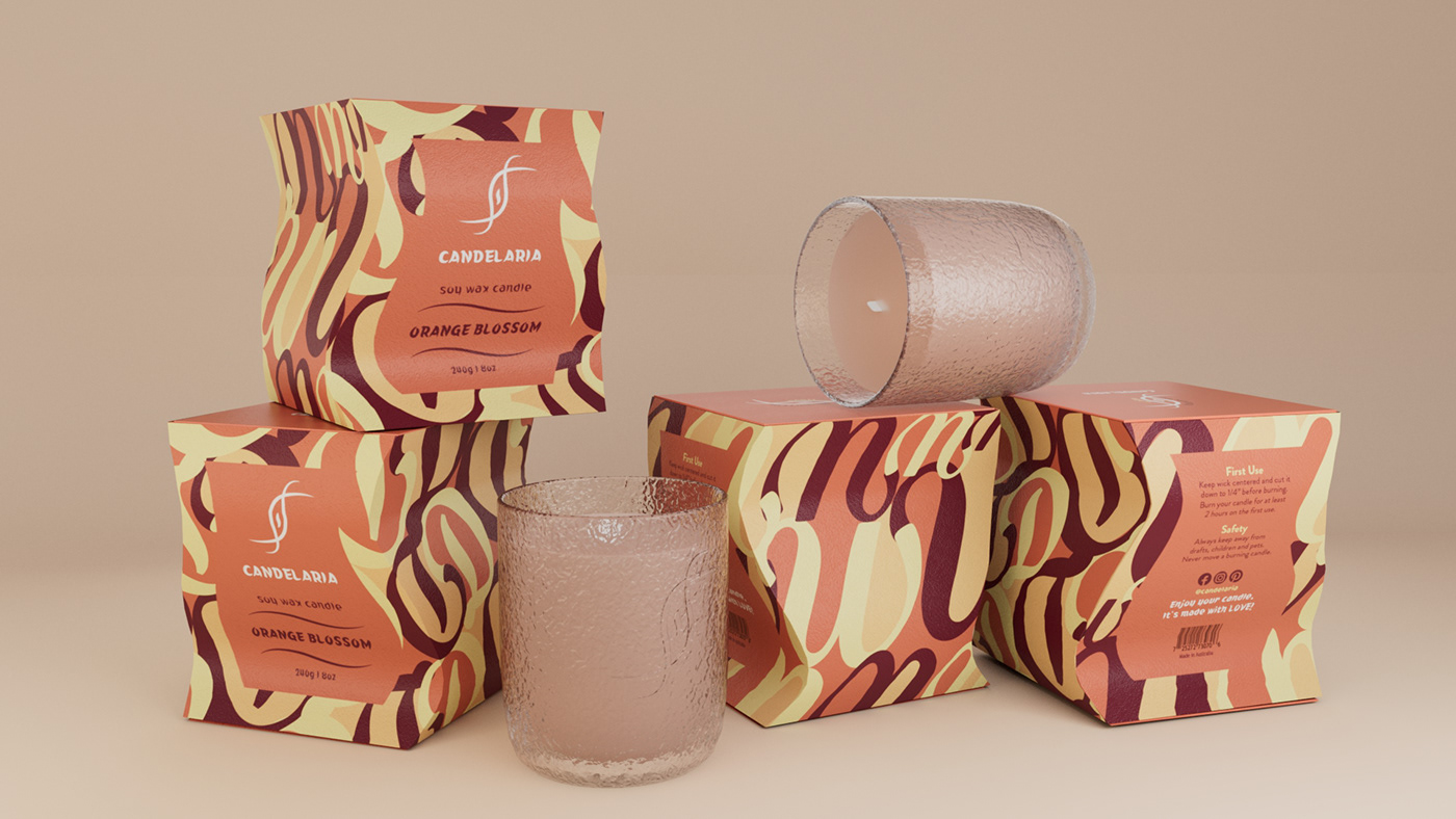
CANDELARIA brings you a warm and healing feeling.

Design
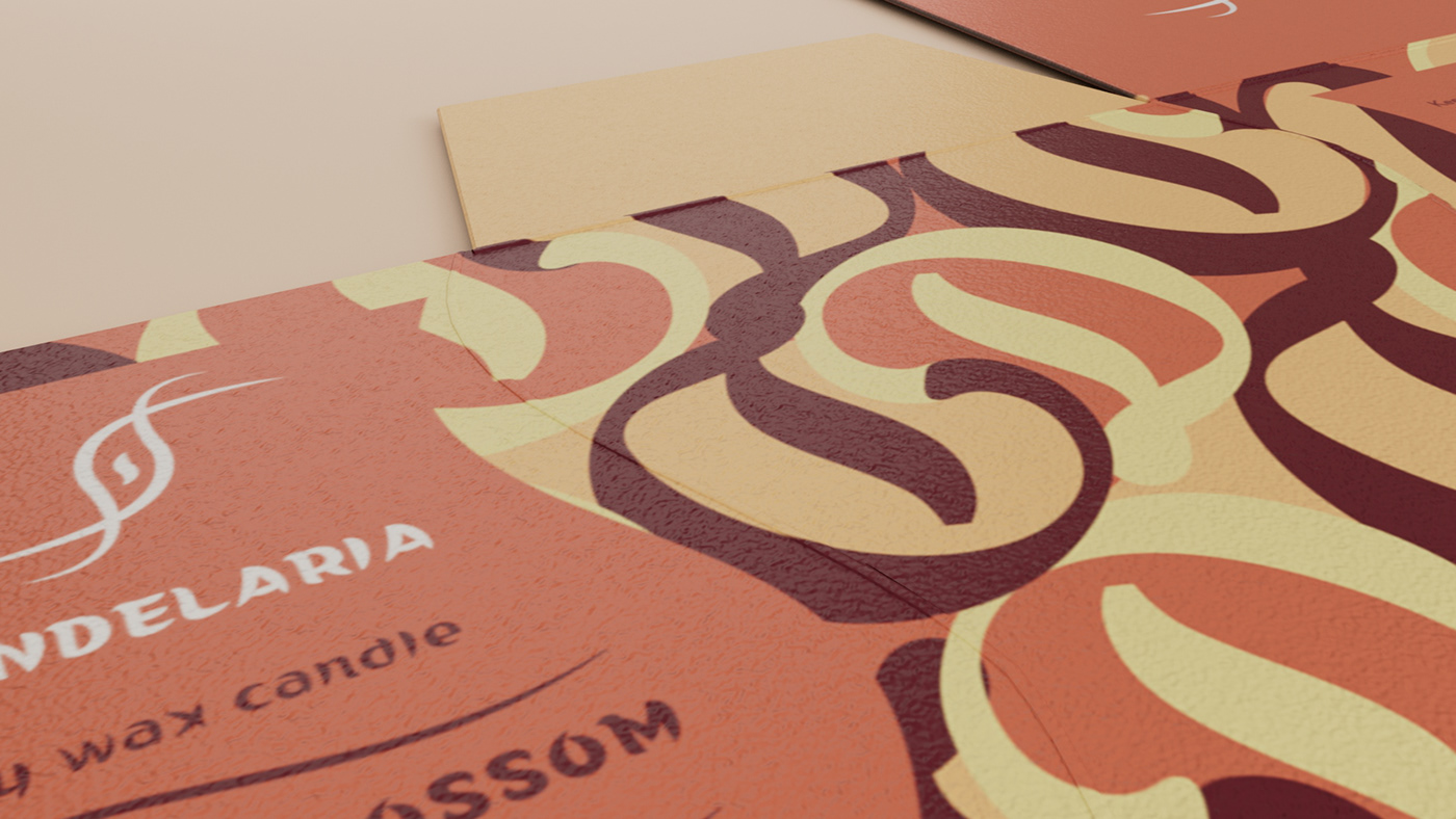
The most distinctive feature of Candelaria is its curved packaging compared to the straight lines of the packaging. In addition to matching the curves of the logo, it also gives a novel and interesting visual experience.
The curves symbolise soft and encompassing beauty. Through their harmonious and emotional effect on the visual senses, the curves lead people to associate and experience feelings of romance or a relaxed atmosphere. This was the original intention behind the design of the packaging.

Graphic Elements
The letters 'W' and 'D' were used to create the entire graphic design of the packaging with the intention of bringing warmth and delightful, and the red tones were used to enhance the warmth and comfort of the visual experience.